Visualization Examples
Visualization of Fluxome Data 2
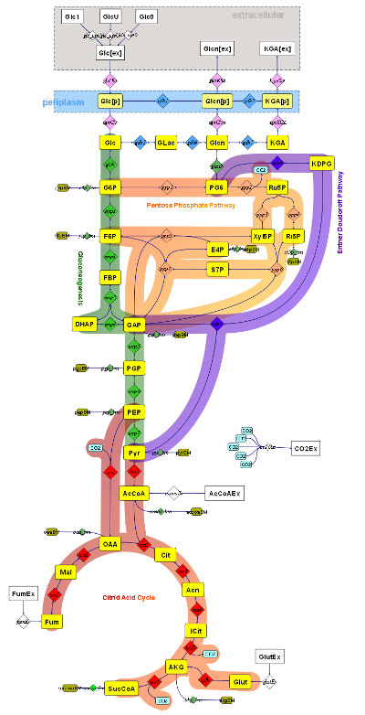
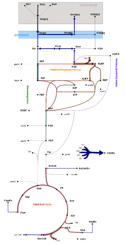
The present example is the visualization of fluxome data of the organism Gluconobacter oxydans. The left image shows the diagram without visualized data. The right image show flux data from two different phases. The diagram is augmented with data from metabolic flux analysis. Here, the flux strength is mapped to the width of the connection lines: strong lines indicate high reaction conversion rates. This information is also reflected by the local width of the pathway stroke. Hence, a global view of the flux distribution over the whole network is facilitated.
A further visual property used in the example is an inversion flag owned by all reactions. If a reaction is set to be inverted, the arrow direction of all its connections reverses. This makes it easy to display a change in the nominal net flux direction without redrawing the arrows in the diagram.
The example has been published in Droste 2011.
Site Overview
Visualization Examples
Imprint |
Terms Of Use |
Privacy Policy
Copyright © 2024 Omix Visualization GmbH & Co. KG. All rights reserved.
Omix® is a registered trademark of Omix Visualization GmbH & Co. KG.