Images: Copyright © S. Miebach
Visualization Examples
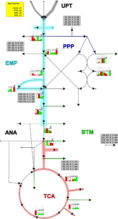
Visualization of Fluxome and Carbon Labeling Data
The image series shows the visualization of data from isotope-based metabolic flux analysis. The flux rates are visualized by locally broaden the pathway shape. Beside the measured metabolites, the ratios of the different isotopic enrichment state of the metabolite (mass isotopomers) are visualized by bar plots.
The example is taken from Miebach 2011.
Site Overview
Visualization Examples
Imprint |
Terms Of Use |
Privacy Policy
Copyright © 2024 Omix Visualization GmbH & Co. KG. All rights reserved.
Omix® is a registered trademark of Omix Visualization GmbH & Co. KG.