Image: Copyright © S. Pflug
Visualization Examples
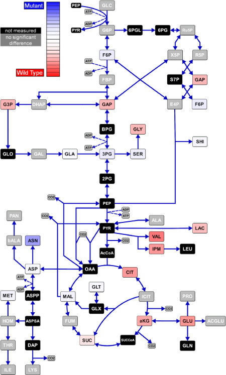
Comparative Visualization of Metabolome Data
The difference between the measured metabolome data of a wild type (Corynebacterium glutamicum) and a mutant (WTΔpyk) is visualized by color-coding the metabolite symbols. Tending to blue indicates that the corresponding metabolite has a higher concentration in the mutant strain. Tending to red indicates higher concentration in the wild type. For the sake of a better overview, the reaction symbols have been hidden here. The example is taken from Pflug 2011. The Omix Visualization Language™ (OVL) allows to change the visual attributes of Metabolites, Reactions, Connections and other diagram components according to omics-data. These attributes can be color, text style, line style, shape and many more. By this, individual data visualization can be created by the user.
Site Overview
Visualization Examples
Imprint |
Terms Of Use |
Privacy Policy
Copyright © 2024 Omix Visualization GmbH & Co. KG. All rights reserved.
Omix® is a registered trademark of Omix Visualization GmbH & Co. KG.